Jogos Santa Casa App
The Jogos Santa Casa App is the official mobile application of the SCML Gaming Department, allowing users to place bets on EuroMillions, M1lhão, Totoloto, Scratch Cards, and the Lottery, as well as check the numbers and results of the Social Games.
The Jogos Santa Casa App offers exclusive features and access to informative and promotional content through its push notification system.
Context
The Jogos Santa Casa App is used for player registration and authentication, involving identity verification, personal data input, and linking a player card.
The original user flow had several friction points and an outdated interface, compromising usability and user trust. The goal of this project was to improve the registration experience and modernise the interface, making it more accessible and user-friendly.
Challenge
As a regular user of the App, I identified several areas for improvement.
Visual outdated interface;
Poorly structured form fields;
Weak contrast and low readability;
Lengthy registration process lacking user guidance.
Redesign Objectives
Refresh the visual design and bring it up to modern standards;
Improve the registration and login experience;
Enhance readability and accessibility;
Create a more fluid and intuitive navigation flow for all users.
Key Improvements
Clearer step by step process with visible progress indicators;
Consistent field labelling and cleaner typography;
Increased spacing and touch friendly inputs;
Improve colour contrast for text, buttons and input fields;
Solid colour buttons and more direct CTA labelling.
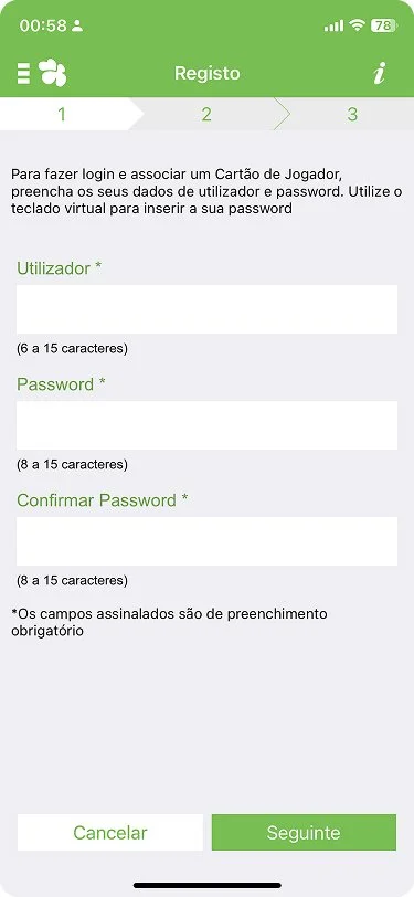
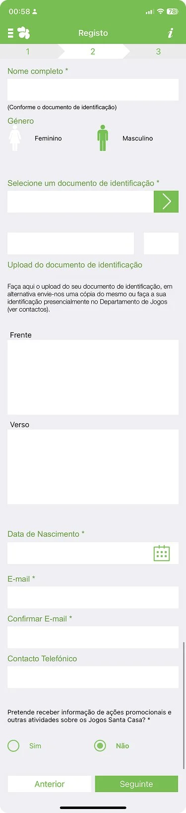
Original App Analysis
The original version presented:
A visually outdated interface;
Dense layouts with limited spacing;
Overly long and unclear instructions;
Poorly guided document upload process;
Poor organisation of form fields causing confusion.
Redesign Solutions
1. Welcome Screen
Brand identity (logo and gradient) maintained;
Clearer focus on the user’s main action.
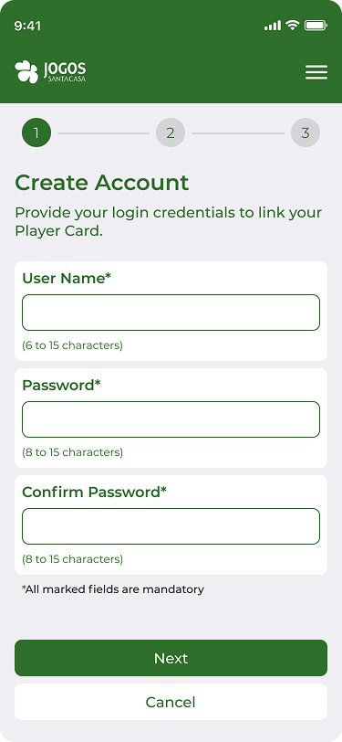
2. Account Creation
Increased spacing and improved visual hierarchy of input fields;
Clearer helper texts;
More prominent and legible call-to-action buttons.
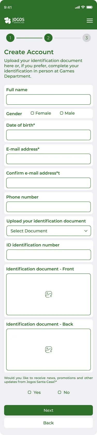
3. Personal Information Form
Clear separation between sections (e.g. name, gender, date of birth);
Added fields for email confirmation and phone number;
Improved organisation of document upload with placeholders and guiding icons.
4. Security & Confirmation
Redesigned PIN input with a modern, clearer layout;
Bullet-point layout for confirmations and terms of service;
Enhanced visual trust indicators.
Before


After